Managing Forms
Configurable forms allow you to customize the data that can be stored in various parts of the system. For example, in Tracker, Form Tabs utilize a preconfigured form, which is maintained in the Admin section of the site. By editing configurable forms, you can determine which fields are available.
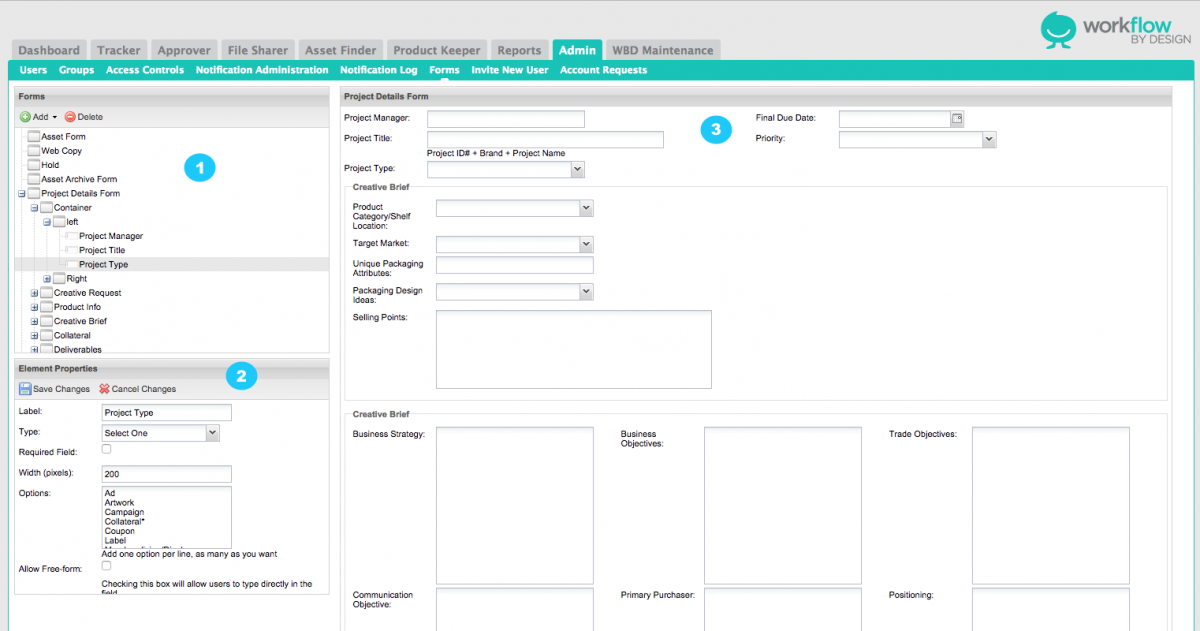
Please click the above image to enlarge.
1. Form & Field List - this area provides a nested lists of all the configurable forms and fields that are setup in your site.
2. Form & Field Details - when you select an item in the form & field list, this area will update to display details of the selected item. You can use this area to modify these details and save the updated configuration.
3. Preview Area - when you select an item in the form & field list, this area will update to show a preview of the selected form. This is so you can see your changes in action while you are making them.
Forms
A form is a set of fields and containers (detailed below), which comprise a form that can be utilized by other areas of the system. For example, Tracker utilizes forms to power its Form Tabs (most importantly, the Project Detail tab). Another example – Asset Manager uses forms to capture asset-specific metadata.
Containers
Containers group related fields visually, making forms easier to fill out. There are three types of form containers:
- Field Group – a field group draws a labelled box around its contents, to give the form a logical organization.
- Column – a column breaks fields up into columns, which can be very useful to maximize the use of screen space and keep the form short and easy to fill out.
- Column Container – a column container always comes before an actual column. So when you are building a form, if you want to add columns, you first add a column container, then add two or more columns beneath it.
Fields
Fields are the individual parts of a form that a user can fill out. Each field has a particular type that defines what type of data the field contains. For example, there are text fields, date fields, checkboxes, etc.
Each field also has a number of other configuration options, some of which are available on all fields, and others that are specific to the type of field being edited.
Field Tags
Each field can be “tagged” to support advanced application-specific functionality. For example, you have options to tag a field to display on the Dashboard status as a filter.
Conditional Fields
Conditional fields are hidden until a particular condition is met. These conditions are based on other fields on the form. This allows making the form “dynamic”, showing and hiding different fields (or containers) based on the user’s previous entries.
WARNING!
Because forms contain data throughout the system, you must be careful not to inadvertently delete data when editing a form. When you remove a field from a form, its data will disappear (we can always retrieve it for your from our daily backups, but it would be easier to not lose the data in the first place). WBD suggests managing forms on the test site first - then migrating changes to LIVE.
Creating Data Fields
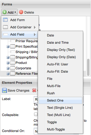
Highlight the form or group to add a new field. Using the Add dropdown, choose Add Field. This will display a list of available fields.
Auto-Fill: Date Fields
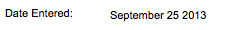
Auto-fill date fields are automatically populated with the current date when the form is first saved. Once a value has been set, it will never change. This is useful for adding fields such as “Created On.”
Auto-Fill: User Fields
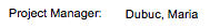
Auto-fill user fields are automatically populated with the current user’s name when the form is first saved. Once a value has been set, it will never change. This is useful for adding fields such as “Created By.”
Date Fields

Date fields provide users with a calendar drop down, or they can simply type in a date using MM/DD/YYYY format.
Date and Time Fields

Date and time fields provide users with dropdowns for the calendar date and the particular time. Users can also type in dates using MM/DD/YYYY format. Times can be entered as HH:SS.
Display Only Fields
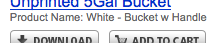
These are system-generated data fields. This field will not be editable by users on its form in the live application. For example, this is the type of field used for Project ID in Tracker.
Single File Fields
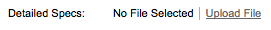
The file field is where users have the ability to upload a file to the form. It provides a browse button so they can search their computer for a file to upload. File fields will also display a link to any previously uploaded file.
Multi-File Fields
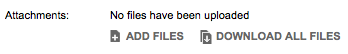
This multi-file field is where users have the ability to choose many files to add to a form. It provides an Add Files button so users can search their computer for files. Once uploaded, users then have the option to enter a description for each file. They will also have the ability to download individually or all at one time.
Rush Fields
Rush fields are specific to Tracker and are to be configured using templates.
Select-One Fields
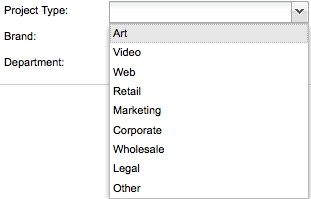
These are simple drop down menus, allowing users to select an item from a predefined list. Select-one fields have a special configuration parameter called Options that allows you to specify the options that should appear in the dropdown. Simply enter one value per line.
Text (Single Line) Fields

These are simple text fields, allowing a single line of text. This is the most common type of field. Text fields have a special configuration parameter called Width that allows you to control the width of the field.
Text (Multi Line) Fields
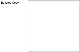
Multi-line text fields allow you to enter long text data, such as a description. These fields have two custom options – width and height –that allow you to control their display on screen.
Toggle Fields

Toggle fields are checkboxes. Each toggle field contains a single checkbox that users can check or uncheck. This is useful for asking yes or no questions.
Toggle fields support one custom option – Text – that specifies the text that should appear to the right of the field (whereas the label is displayed to the left).
Multi-Toggle Fields
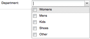
Multi-Toggle fields are a combination of a Select One and a Toggle. This field allows users to choose more than one item from a dropdown list - very useful for applying multiple options to a single field. Warning! Multi-toggle fields cannot contain commas in options.
Element Properties
There is a set of common options that are available to all fields.
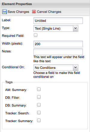
- Label – this is the name of the field that will appear on the form.
- Required Field – checking this option will require users to enter a value for the field before they can save the form.
- Notes – any text entered in the Notes option appears under the field as instructions or tips for users.
- Conditional On – the field selected in this box will be used to hide or display the field being edited. Once you select a field in the Conditional On box, two more fields will appear, allowing you to specify the desired condition.
- Tags – tags configure application-specific functionality and are covered by the application-specific admin guides.
More About the Tags
AM: Summary - Displays the field on screen under each asset title. ex: Product Name
DB: Filter - Shows the field on the Dashboard as a filter option. ex: Project Type

DB: Summary - Shows the field on the Dashboard under each project title; shows in grey text.

Tracker: Search - Adds field to search list allowing users to search by this field.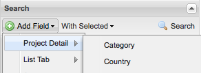
Tracker: Summary - Shows the field under the project name at the top of each Tab view; shows in grey dropdown text.